![]()
A while ago a question was asked on stackoverflow, Most underused data visualization. Well, instead of being that guy who crashes the answering party late, I will just use this platform to give my opinion. Small Multiples
For a brief intro on what small multiples are see this post on the Juice Analytics blog, Better Know a Visualization: Small Multiples. But here briefly, small multiple graphs are a series of charts juxtaposed in one graphic (sometimes these are referred to as panels), that have some type of common scale. This common scale shared by the panels allows one to make comparisons between elements not only within each panel but between the panels.
I know small multiples aren’t per se a data-visualization. Maybe it could be considered a data visualization technique, which can be applied to practically any type of chart you can think of. I also don’t have any data to say it is underused either. I’ll show a few examples of small multiples here in this post, and most contemporary stat software has the capability to produce them, both suggesting it is not underused. But, I believe small multiples should be a tool we use frequently for data visualization based on the wide variety of situations in which they can be usefully applied.
The problem
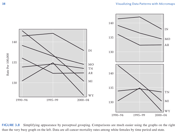
It is quite easy for one chart to become either too busy with elements that it becomes very difficult to interpret a graphic, or that over-plotting of the elements occurs (i.e. objects within the chart overlap). I think a great example of this is demonstrated in Carr and Pickle (2009) (originally taken from Elements of Graph Design by Stephen Kosslyn). In the example below, we can see that simply reducing the number of line elements within each chart allows the analyst to get a much better sense of each of the lines, and how they relate to one another, much more so than in the original chart with 6 elements all in one.
Other frequent uses of small multiples are to graphically explore relationships between subsets of the data (for an example of this, see this post of mine over on Cross Validated) , or multiple variables (such as in a scatterplot matrix).
Some random things to keep in mind when making small multiples
Maximize color contrast to be able to distinguish patterns in smaller displays.
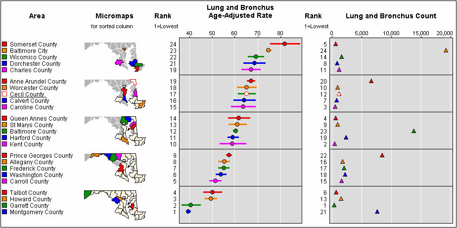
Because of the reduced real-estate used for each panel in the graphic, more nuanced changes (such as slight changes in color saturation or hue) are harder to perceive. Increasing the contrast between different color categories, using dichotomous color schemes, or only displaying certain sets of the data are a way to acheive a greater amount of contrast. Richie Cotton on the original SO post pointed to a good example of this for Horizon Graphs. Also an example of small multiple maps by Andrew Gelman which uses a dichotomous color scheme when mapping attributes to U.S. States is another good example. An example of only displaying certain sets of the data can be found by examining linked micromaps
Because of the small space, reducing information into key patterns can be useful.
A good example of what I mean here is for large scatterplot matrices only plotting the bivariate elipses and a loess smoother instead of all the points (see Friendly, 2002). Below is an example taken from the R Graphical Manual

The same type of smoothing and plotting bounds on data can be extended to many line charts as well.
My last bit of advice is don’t expect to only make one graph. But feel free to stop by at Cross Validated for some suggestions if you get hung up on a tough data visualization task.
AndyW
References for Further reading on Small Multiples, and their benifits
Carr, Daniel & Linda Pickle. 2009. Visualizing Data Patterns with Micromaps. Boca Rotan, FL. CRC Press.
Cleveland, William. 1994. The Elements of Graphing Data. Summit, NJ. Hobart Press.
Friendly, Michael. Corrgrams: Exploratory displays for correlation matrices. The American Statistician 56(4): 316-324.
Tufte, Edward. The Visual Display of Quantitative Information. Chesire, CT. Graphics Press.
Let me know in the comments if you have any suggested references, or your favorite examples of small multiples as well!
Filed under data-visualization viewpoints
Subscribe to comments with RSS.
Comments have been closed for this post